- Active Investing - what is it?
- All Weather Trading Plan using Complex Theory (Parts 1 - 4)
- Asset Management (Parts 1 - 4)
- Back Testing
- Breaking out from consolidation
- Breakout trading in all market conditions
- Charting in a Nutshell
- Children of the Bear
- Fibonacci and the Golden Ratio
- Going Public
- Hull Moving Average
- MACD Breakout Trading (Parts 1 - 2)
- Making decisions with a Simple Moving Average
- Probability: do you have the stomach for it?
- Profit Taking
- Relative Strength
- Record Keeping
- Risky Business
- Short Selling
- Social Media Bubble
- Switching Gears
- Rate of Return indicator
- Time and Money
- Tools of the Trade
- Trade Warrants (Parts 1 - 4)
- Trading without spending money
- Trendlines
- Triangles
- GMMA's on Weekly Charts
- Writing Custom Indicators
Articles include:
With all this technology at our fingertips it is very hard not to get caught up in the popular sport of speculating on the future direction of world equity markets. It is even harder to stay out of these discussions when attending Traders Expo's or similar events. Not only are the visitors to such Expo's often trying to foretell the future but I usually find myself being engaged by some respected experts on share trading who also want to expound their pet theories on the subject. But let me clarify at this point that whilst Professional Traders will engage in academic speculation, their strategies are based on probability... not prediction.
Now if you think that I'm above this type of chart driven hypothesizing then you would be WRONG !!! It's just that it makes more sense to me to write an article that hundreds will read rather than just talking to a handful of people... be they respected experts or not. Now there's a point - whoever said that great minds think alike has obviously never been to a Traders Expo.
One popular sport is 'PICK THE MARKET BOTTOM' and the period in the Stockmarket surrounding October of 2002 was well suited to this particular game. My preferred Index for use as a global equity market barometer is the Dow Jones Industrial Average, pictured below.
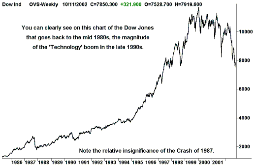
If you haven't seen a chart like this before then you will probably find it a bit scary. Experts around the world are constantly harping on about 'Historical norms' and there is no doubt that the excesses of the late 1990's took the New York Stock Exchange, NYSE, well away from its earlier glide path of the late 1980's and early 1990's. So, theoretically, divining the 'Historical norm' is a simple task, achieved by placing a trend line on the above chart.
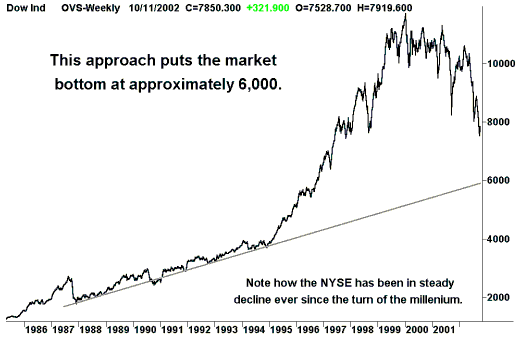
Now this all looks very straight forward and all we had to do in late 2002 was sit back and wait for the Dow Jones to bottom out at 6,000 before we even thought of re-entering the market on the long side again. But the fun is just beginning because this type of simple analysis is hardly going to satisfy my thirst for mathematical complexity (and I'm sure I'm not alone).
What's more it makes the very simplistic assumption that the relationship between financial markets and the passage of time is linear in nature. In fact the relationship between any monetary system and the passage of time is neither linear nor constant. For example, if the relationship were constant then 1 dollar today would be equal in buying power to 1 dollar from 50 years ago... clearly not the case. So in order to determine the 'Historical norm' we need to address the question, 'How do financial markets progress over time?'.
(This is where the fun starts... not to mention the arguments.)
To solve the riddle we need to take a look at how the value of 1 dollar, and in turn everything that we quantify in monetary terms, varies from year to year. Whilst I don't think that the Consumer Price Index, CPI, encompasses all macro economic factors, it will serve my purpose in illustrating the nature of the relationship between the value of 1 dollar and the passage of time.
Imagine that you had $10 in the year 1920 and it could buy 1 Widget. But the price of goods rose in 1921 by a factor of 5% (example only), the rise in the then CPI figure. This means that your $10 from 1920 can only buy part of 1 Widget, which is now priced at $10.50 in 1921.
The fraction of 1 Widget that you can buy with $10 is 10/10.50 = 0.95
or, putting it another way...
1 Widget is equal to $10 in 1920 which is equal to $10.50 in 1921
In fact if we assume that the change in the annual CPI is constant at 5%, we can take this whole process a step further and determine the purchase price of a single Widget for each year from 1920 to, let's say, 1939... a period of 20 years.
| Year - | Purchase price of 1 Widget |
| 1920 | $10.00 |
| 1921 | $10.50 |
| 1922 | $11.03 |
| 1923 | $11.58 |
| 1924 | $12.16 |
| 1925 | $12.76 |
| 1926 | $13.40 |
| 1927 | $14.07 |
| 1928 | $14.77 |
| 1929 | $15.51 |
| 1930 | $16.29 |
| 1931 | $17.10 |
| 1932 | $17.96 |
| 1933 | $18.86 |
| 1934 | $19.80 |
| 1935 | $20.79 |
| 1936 | $21.83 |
| 1937 | $22.92 |
| 1938 | $24.07 |
| 1939 | $25.27 |
And you guess it, lets plot the results on a chart...
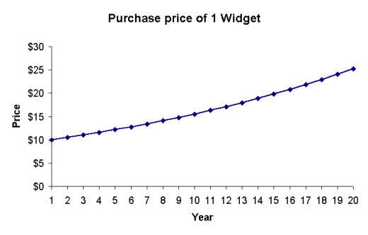
Note that we are looking at a curve and not a straight line, indicating that the relationship between the purchase price of a Widget and the passage of time is non-linear. It now pays to think of our Widget as a share. So the $10 that we converted to 1 Widget, or rather 1 share, in 1920 could be converted back to $25.27 in 1939 if we were to sell. But remember that in real terms, $10 in 1920 is equal to $25.27 in 1939 with respect to its buying power... hence, we haven't actually made any profit as the intrinsic value of our widget hasn't changed during the intervening 20 year period.
So if the relationship between the value of money and the passage of time is non-linear then what is it? The answer is to be found in the mathematical formula that relates the value of $1 from one year to any other year in the future.
$1 from year 1 (denoted as $11) relates to $1 from n years later (denoted as $1n) by the formula:
where CPI = the change in the CPI + 1,
ie. a 5% rise in the CPI would be expressed as 1.05
Example
The easiest way to understand any mathematical formula, and to verify it, is to plug in some real values... an easy task for us if we use the earlier example of our Widget. Applying the above formula to determine the value of our Widget in 1925 we get:
| $ value of 1 Widget in 1925 | = $10 x (1.05)5 = $10 x 1.05 x 1.05 x 1.05 x 1.05 x 1.05 = $12.76 |
This answer coincides with the result shown in the table for the value of our Widget in 1925.
Hence the relationship between the value of money ($1n) and the passage of time (n) is exponential in nature, according to the formula $1n = $11 x (CPI)n. Now, once we're through patting ourselves on the back for being so clever, we have to take this new found understanding and apply it to the original problem of projecting 'Historical norms' on a chart of the Dow Jones Industrial Average... remember.
Well for starters, the Dow Jones Industrial Average defines the value of public companies, which can also be defined in dollar terms, making the progression of the Dow Jones subject to our understanding of the relationship between time and money being exponential. That said... we now face the problem of 'How to project historical norms on a chart if we can't use trendlines?'. The obvious but ugly answer is that we use curves on our chart of the Dow Jones as opposed to straight lines. This will work but how do we know if we're using the right curve?
Fear not... for this is one of the problems that precipitated the development of the 'Logarithmic' or 'Semi-log' scaling function, available in most popular charting programs. With the help of logarithmic scaling we can overcome the need to use curves on a 'Linear' scaled chart by using straight lines on a logarithmically scaled chart instead. Here's how and why it works... by taking the logarithm of an exponential expression we, in effect, convert it to a linear expression.
Example
If Log10 100 = 2 where 100 = 102 then $11 x LogCPI (CPI)n = $11 x n
Thus, by employing a logarithmically spaced vertical scale on our chart of the Dow Jones Industrial Average we will, in effect, convert our earlier formula to a linear expression...
$1n = $11 x (CPI)n will become $1n = $11 x n
... and we can now project our historical norm from the late 1980s and early 1990s using a straight line, as shown in the following logarithmic chart.
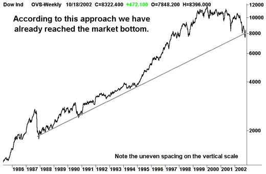
So, having negated the effect of the exponential relationship between time and money with the use of logarithmic scaling, we come to the clever conclusion that the Dow has hit the bottom at approximately 8,000 instead of the earlier and much simpler conclusion of roughly 6,000.
- But here's the bad news...
- There was fairly minimal inflation during the time period depicted by the above chart, which would largely negate the exponential relationship between time and money.
- The logarithmic scale that my charting program employs isn't calibrated to the relevant changes in the annual CPI figures published in the U.S. each year.
- The annual changes in the U.S. CPI aren't constant (an assumption I made at the very start of my hypothesizing), making this whole approach an approximation anyway.
The last point being a very good reason why I am always extremely sceptical when I read anything written about Elliott Wave theory that attempts to predict turning points in world financial markets with pinpoint accuracy. Some noted Elliott Wave theorists love to employ logarithmic scaling without even bothering to explain why they are doing it, let alone justify the actual log-base being used. But in October 2002 I would have stated, with confidence, that the market bottom was somewhere between Dow 6,000 & 8,000... for the purpose of conversation.